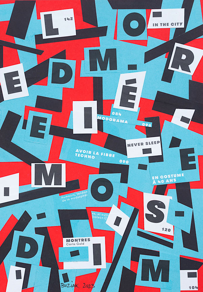
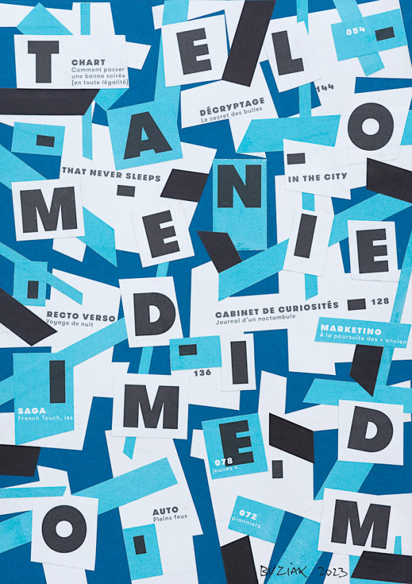
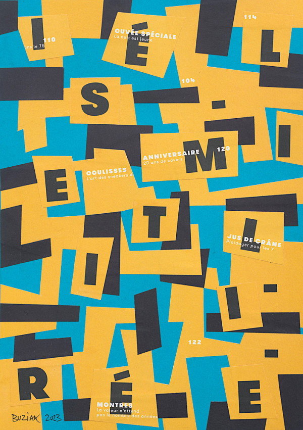
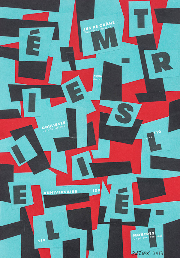
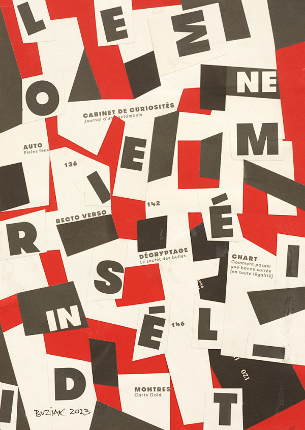
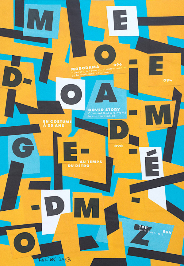
One of a short series of collages inspired by the accomplished graphic designer Saul Bass - but which are not posters, or illustrations with or without a message… purely abstract exercises - I cut the bold capital letters from a few torn-out index pages from some old French “L’Option” magazines, leaving each page whole but with hard-edged cuts, holes and gaps so that the entire page could then act as a negative to stick over a positive backing sheet of a different contrasting colour… to which the cut-out letters were then stuck with a random balance in mind to make an attractive graphic composition.
The backing paper is 1/4" wider than the image content to allow for proper framing under a 'passe-partout' or beveled mat card.
- Subject Matter: Abstract typography
- Created: February 2023

